Raymond Weilacher Design
  • Home
  • 7-Eleven App
  • Michaels B2B
  • 🔒 Albertsons Enterprise
  • 🔒 Echopark.com Strategy
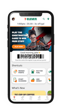
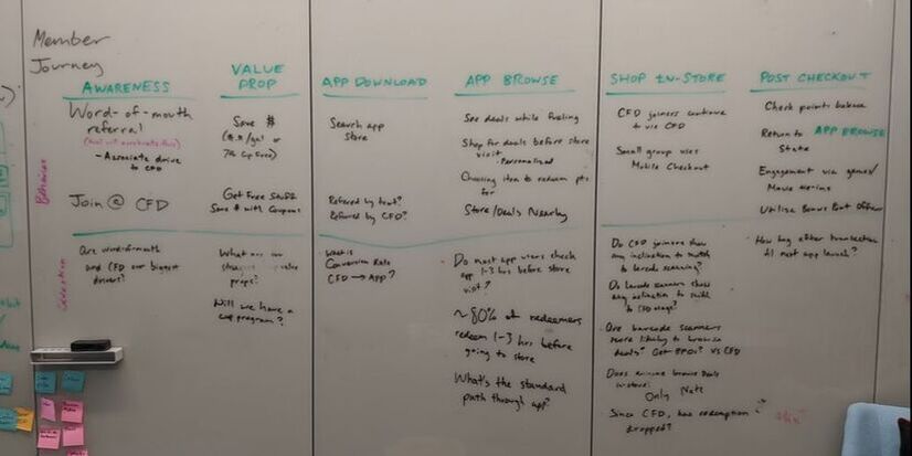
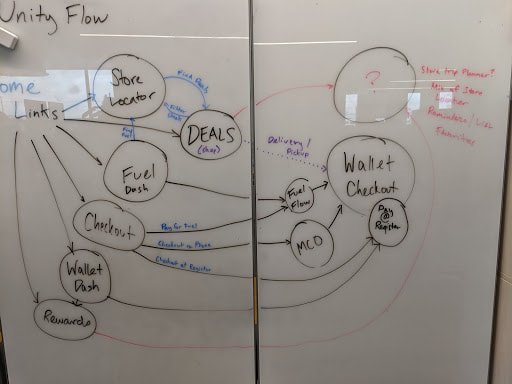
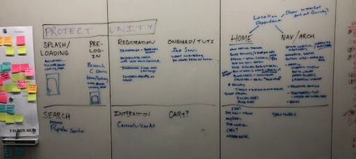
key accomplishments:
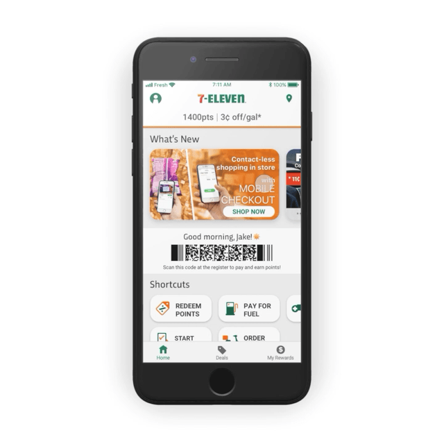
drove $5.8M in incremental spend from v1 to v2 and a further $1M from v2 to v3 with the power of user centered design
won awards for user experience from The Association for Customer Loyalty, Convenience Store News, and more

7-Eleven loyalty App redesign

Picture
My role: Lead UX Designer. Managed the project, coordinating work of 6 designers and 1 researcher. Information architecture, user-centered design, interface design, advanced prototyping.
Picture
5 siloed projects became 1 seamless experience
Picture
$1,066,340 in incremental spend versus control market in the first 30 days of launch
Picture
238% increase in engagement with personalized deals vs. previous app version
Picture
Fuel mobile transactions grew 76% week over week since the launch of the Redesign MVP

Customer Problems

  1. Unclear customer benefit. Customers did not understand the 7Rewards loyalty program. They did not see the value of earning and spending 7Rewards points.
  2. Difficulty understanding and accessing services. The existing information architecture of the 7-Eleven app could not support new journeys and services such as mobile checkout, fuel payment, and a loadable digital wallet.
Picture
Research showed new users often joined 7Rewards in order to get a particular welcome offer but soon became inactive, due to not understanding how to take advantage of the benefits of the program. Even users who understood the concept of points from other loyalty and rewards programs found that points accumulated too slowly to provide a strong sense of value. And finally analytics showed me that a large group of users had acquired enough points to redeem a free item but had never done so, suggesting that 7-Eleven could make the process easier and more apparent. 

Additional research was completed under my direction to assist with the information architecture of the redesign. A card sorting activity provided direction by letting me know which services and features customers expected to be related. Since these services were owned by completely different product and development teams, I had to have difficult conversations with project owners who were being made to, for the first time, play nicely with each other. I had to constantly remind them that our customers did not see 7-Eleven’s services as distinct experiences but as offerings from one monolithic brand. 

Further research would lead to additional crossing of different journeys and present synergies which enabled my design team to pivot towards truly customer-obsessed designs.
Picture

The Conceptual Prototype

Picture
I assembled a cross-functional design and research group to brainstorm the necessary design changes that would enable us to solve our two main customer problems: understanding of the program and easy access to new 7-Eleven services.
​

We arrived at these pillars that would support the new experience:
  • Navigation and information re-architecture
    • Allow intuitive and flexible access to 7-Eleven’s new services
    • Universal search to provide users an alternative to browsing
    • Contextual controls like FABs (floating action buttons) that allow for cleaner user journeys and allow for customer-friendly navigation
  • Home screen
    • A modern, clean visual design that could serve as a spearhead for a fully developed design system
    • Modular home screen sections that could be rearranged based on the customer context, giving smart suggestions as to how the customer can get the most value from the program
  • Education
    • Designing prominent content sections to educate the user on the program as a whole
    • Contextual educational content that explain many of the program’s varied mechanics, as well as answering “why-should-I-care?” to increase conversion and engagement
  • Overhauled registration and onboarding
    • Increase conversion
    • Provide personalization by allowing users to set interests and preferences

Prototype #1

This initial work led to a very fast turn-around on a working prototype. The reason for jumping from problem statement to functional prototype so quickly was that the main product owner of 7Rewards had not gotten buy-in from our Chief Digital Officer to start work on a full app redesign. A concept prototype allowed me to support her vision and give leadership a touchable statement of vision that gave us the buy-in we needed.
Picture
Picture
After initial testing with users, it became clear that there was significant confusion about some of 7-Eleven’s services, which internally were staffed by completely different product and development teams. Customers expressed their confusion.

  • How do I scan my barcode to earn points?
  • Do I have to scan a different barcode to pay with my app?
  • What exactly am I scanning when I want to checkout on my phone?
  • What's the difference between “Mobile Checkout” and “My Wallet”? When do I use one or the other?

It took a considerable amount of empathy and frustrating research results for UX and product to begin to understand that the internal 7-Eleven divisions did not mean squat to users who wanted to effortlessly earn points and experience true digitally-enabled convenience.

Negotiating The MVP

Armed with customer and stakeholder feedback, and with buy-in from leadership on a whole app redesign, I set about aligning on an MVP of the app redesign with product and technology. I lead a session in which we negotiated on what features would be essential to the experience and/or those which we believed would give the greatest business return on effort.
Picture
I took the features of the decided-on MVP and assembled a sprint plan that would ensure the MVP was delivered on time, while grouping tasks into manageable and sensible chunks of work. Seeing that I and my core team of one other designer and one researcher would be unable to handle the work in time, I tapped my manager to see who else could help. Thankfully, our near-shore team in Merida, Mexico had several designers whose projects had just been postponed for organizational reasons. My team of two designers grew to a team of six and one researcher over the next few weeks. While more and more of my time was spent managing, reviewing, and coordinating the work of others, I never stopped designing key screens and prototypes. And I used my position as lead designer of the team to ensure we maintained a consistent architecture and that all work supported the customer journey that we had identified.

Prototype #2

The second prototype was assembled to test navigation and ease of use. Participants were given a variety of tasks across several 7-Eleven services including:

  • You decide to pay for gas with the 7-Eleven app.
  • You would like to use your app to earn points in the store.
  • You would like to pay for your store purchases using your 7-Eleven app balance.
  • You would like to spend 800 points to get a free bag of chips.
Picture
The major insight of the second study was that anytime users were asked to use their app to pay for something (pay for gas; use their app balance; etc) they instinctively went to Mobile Checkout, which is an entirely different function (Mobile Checkout is a service for scanning items in store and paying on your phone without ever going to the register). Once again our familiarity with internal team structures was causing us to design in a way that was not intuitive to our customers.

The Breakthrough

I scheduled a brainstorm session for my team and presented a challenge. I flipped our paradigm by suggesting that instead of a rewards app (the 7Rewards loyalty program is the foundation of the app), we consider how the app would be redesigned as an eCommerce app. 

At this time, 7-Eleven technically does have an eCommerce app that is completely separate from the main 7-Eleven app. It is called 7NOW and is a delivery app. I challenged my team to not let this distinction hinder them. 

What we arrived at was a customer journey structure that had one main theme. To a customer’s mental model, they are shopping at 7-Eleven no matter the item or the process of shopping. They do not care that one team builds the Mobile Checkout functionality and another team handles Delivery. We formulated a flow that spelled out this model. 
Picture
Based on the user’s context, they take an action to shop for items (either by scanning, browsing, searching, starting a fuel transaction etc), then choose how they’d prefer to receive the items. All payment methods should be consistent since there is one 7-Eleven rather than a hidden menagerie of product teams. 
​

Instead of a bewildering assortment of sub-branded products, customers are presented with one main action--Checkout--which leads down various paths depending on the customer’s context. Our third prototype was quickly built to test this key difference.
Picture
Picture
The results of the third study were truly astounding. Not only had we refined the visual style and layout of the Home screen, including a variety of customer friendly sections devoted to explaining the value of the 7Rewards program, but we were finally able to design a solution that matched the extremely complex 7-Eleven digital ecosystem to the customer’s mental model.​
Picture
As a result of the novel navigational design, the success rate for the Pay for Fuel and Pay with Wallet tasks was much higher than in the previous study. ​

​On the whole, the final prototype scored 95.7/100 SUS score (Systems Usability Scale). When asked about the overall experience and how it compares with their favorite rewards app, participants had this to say:
This is one of the best apps I’ve seen out there for rewards.

[This app] does way more than any rewards app I’ve used in the past.

Way more interactive [than Ibotta].

I wish some of the other stores I shop at would have this.

I don’t think I have a rewards app as robust as this.


Problems Solved

  1. Made the benefits of the rewards program transparent. Creating space on the Home screen for educational content provided customers more proof of the benefits of the loyalty program. Designing contextual modules for spending and earning points on the Home page made the points economy transparent and reduced the mental burden on the customers.
  2. Created a framework for all of 7-Eleven's digital services to work together. Redefining the customer journey and information architecture of the app by framing it in various existing mental models allowed us to create a unique IA and progression that was intuitive and sensitive to the user's context.
Picture
Prototype of Unity MVP, released June 2020.
Copyright 2023 Raymond Weilacher
  • Home
  • 7-Eleven App
  • Michaels B2B
  • 🔒 Albertsons Enterprise
  • 🔒 Echopark.com Strategy